
Tracy Aviary
UX/UI Redesign
Project Overview
Tracy Aviary inspires curiosity and caring for birds and nature through education and conservation.
Our goal was to focus on the user path for both donations and daily admissions. In addition, we wanted to emphasize across the site that yearly memberships come with great benefits and should be considered
Role
UX/UI Designer
DateJuly 13th, 2022
Team
Kyle Hatch, Amanda Fuller, John Kennedy
ToolsFigma, Miro, Adobe CC, Google Drive, Invision
Exploring the problem
Tracy Aviary is struggling to get repeat customers to visit the sanctuary, and few people purchase memberships or offer yearly donations. Continued lack of donation and low membership sales may leave Tracy Aviary unsustainable
The SolutionOur goal was to focus on the user path for both donations and daily admissions. In addition, we wanted to emphasize across the site that yearly memberships come with great benefits and should be considered
User Research
Where to begin
At first glance, the site looks properly taken care of
There are some obvious UX/UI changes that need to be made, but without knowing exactly what I needed to fix, I decided to create a survey to find out more about our users and their experience
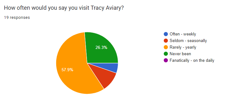
Survey Data
We created a survey that went over how often they visit the aviary, why they visit, how their experience was, how they purchased tickets, and if they have ever donated
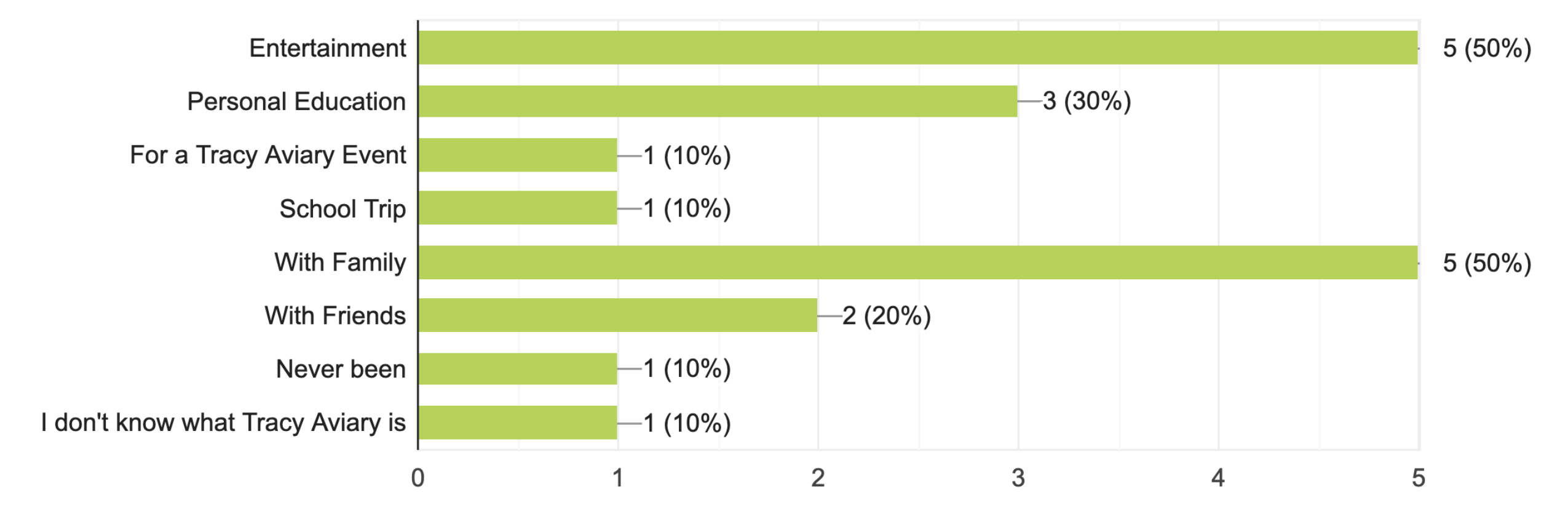
What brings our customers in?
Organizing our data
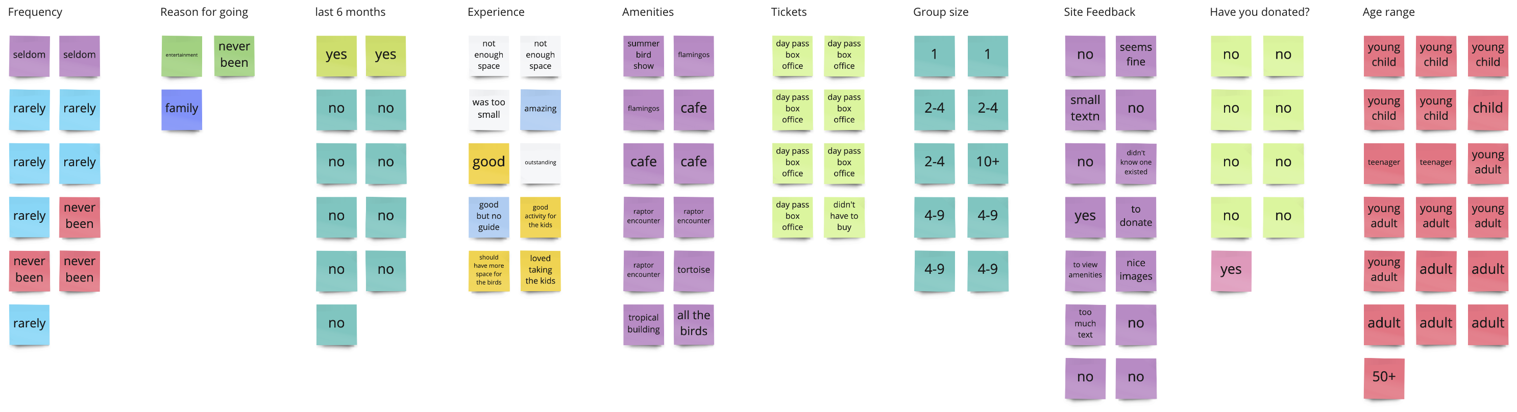
User Insights
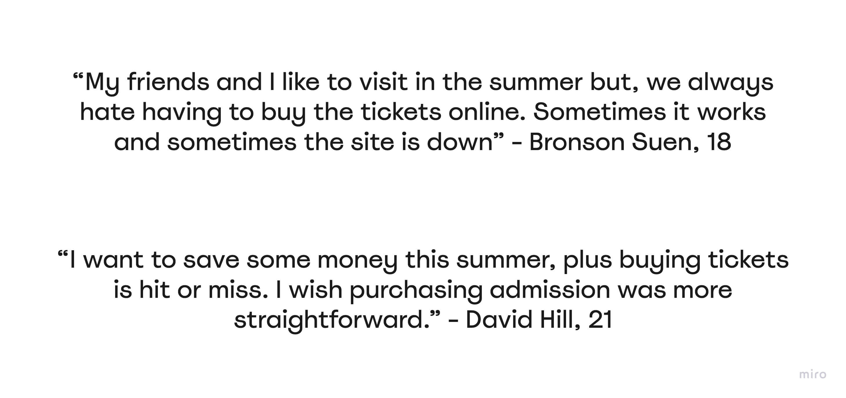
User Interviews
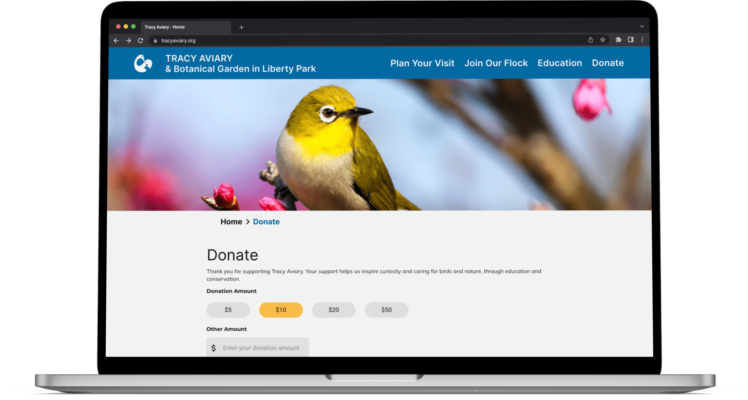
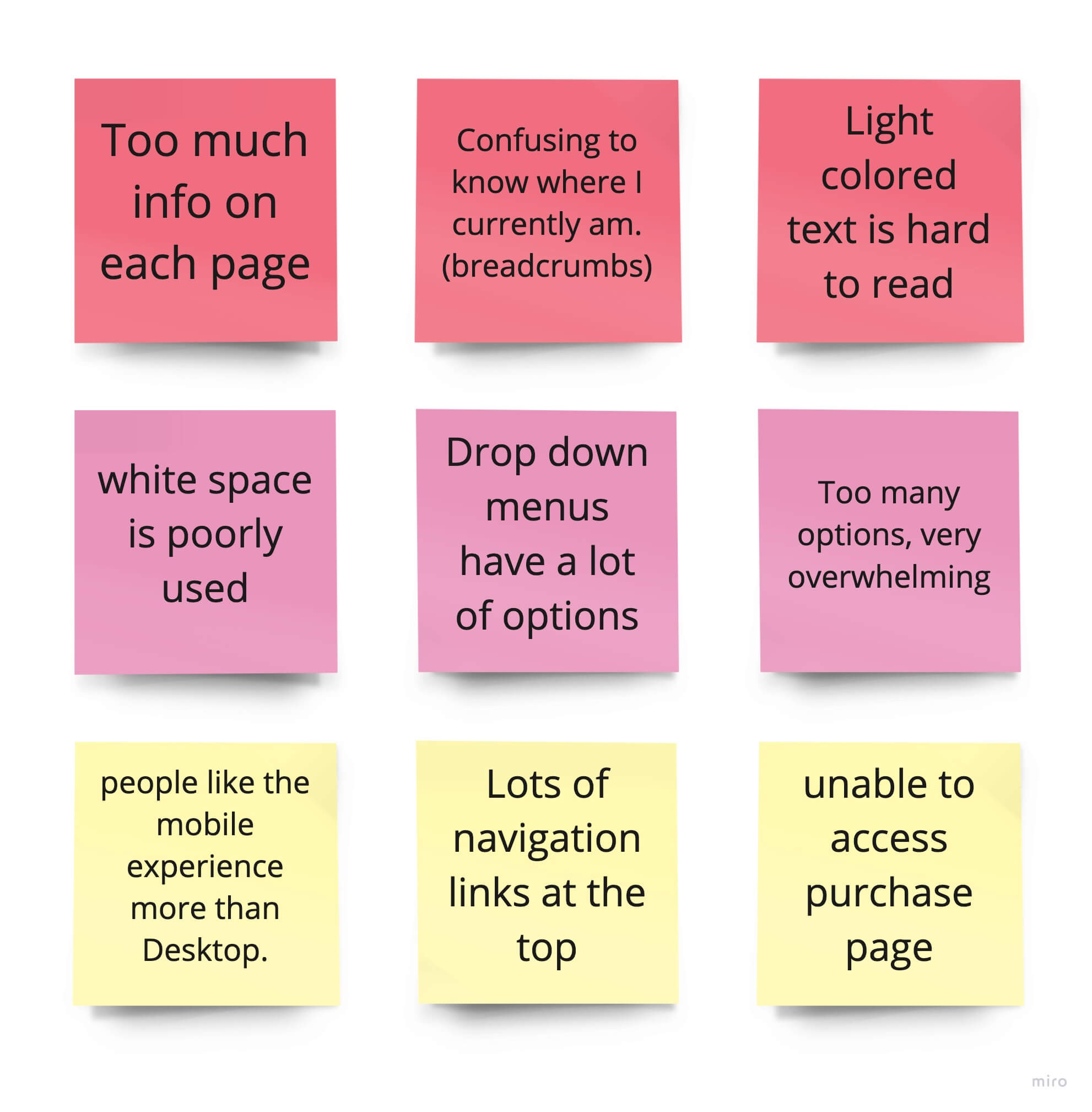
The ability to purchase tickets and to make a donation to the aviary is confusing and difficult to navigate
This was due to having poor contrast between text and background, not having a grid system in place, and a poor hierarchy of elements
Definition & Ideation
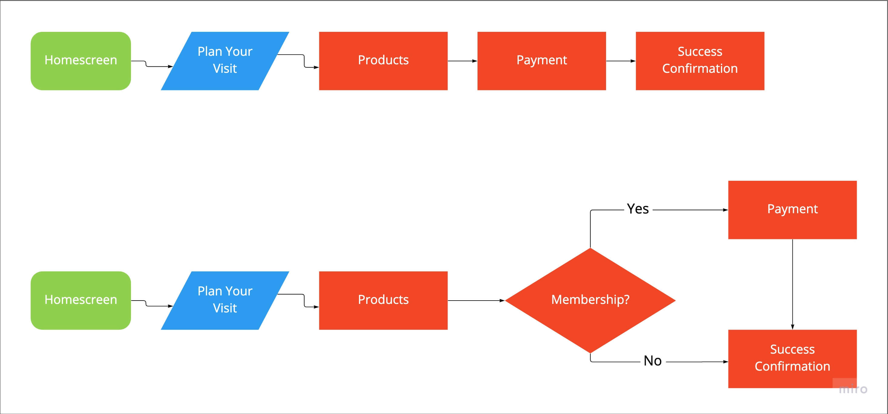
Updated User Flow
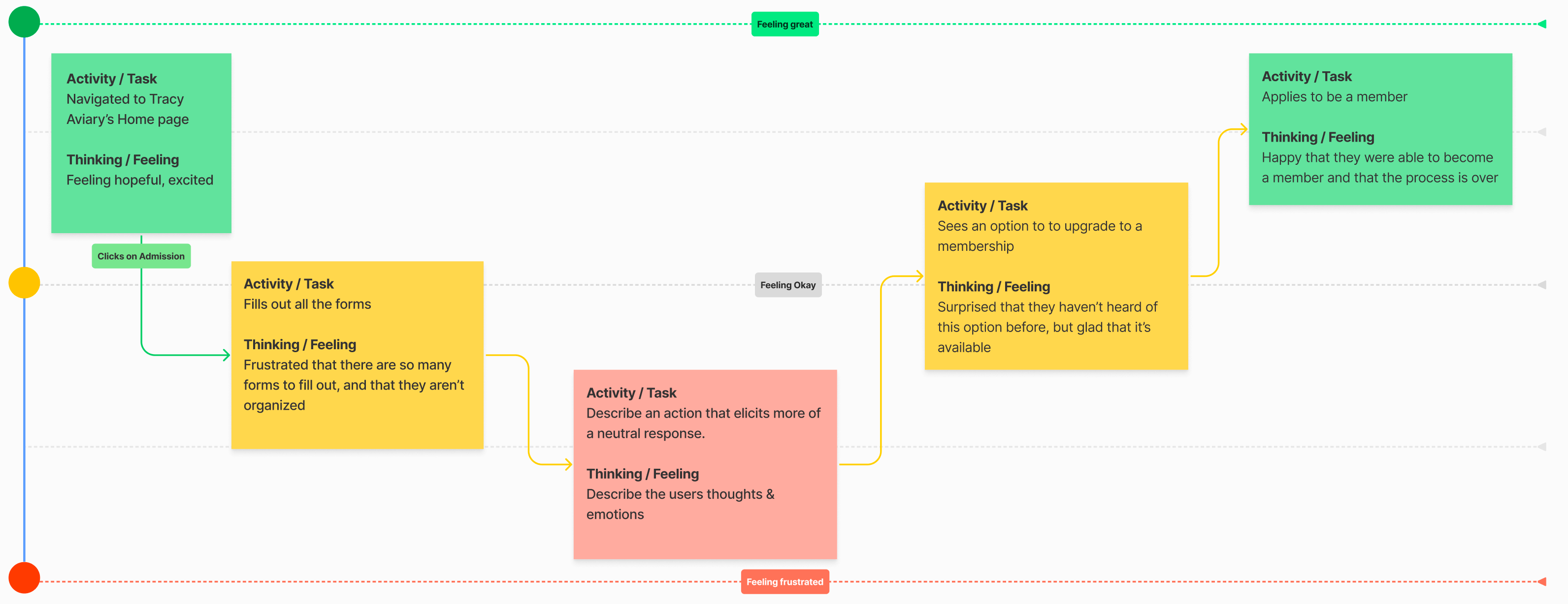
User Journey Map
Bronson is looking to purchase Admission tickets online
The membership page is scattered and confusing to navigate
Bronson is happy to have found the Membership option, so he has access all year and won't have to purchase tickets online anymore
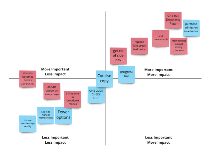
Feature Prioritization Matrix
My team and I sorted through our data from our 'Like/Wish/What-If' scenario and put it into a Feature Prioritization Matrix. Based on the data, we saw that purchasing tickets online, and donating was where our users had the most struggle, and since it's a big part of the non-profit, we decided to tackle those things first.
Develop Phase
Testing
Final Thoughts